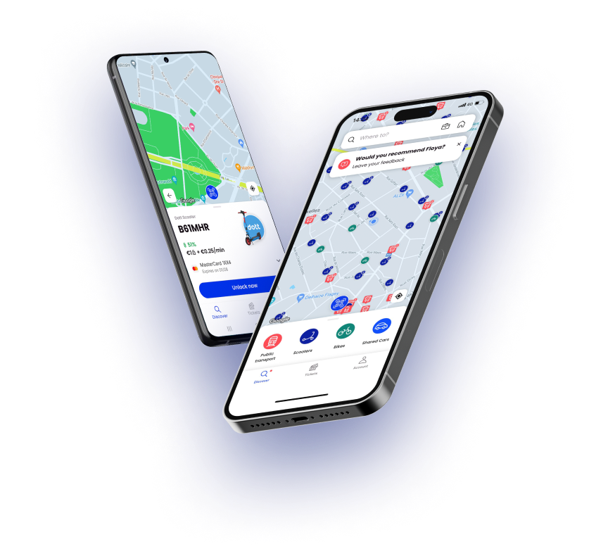
Floya, that’s all Brussels!
Floya is Brussels. Diverse Brussels. Dynamic Brussels. Inventive Brussels.
Brussels never stops and neither do you?
With Floya you’re in control. What, where, when and how: you choose. Driving can be tiresome and variety means freedom.
But while there are buses, bikes and scooters on every street corner, managing 10 apps is too complicated. Floya contains all your mobility options, from shared cars to walking. Plan, book and pay: with Floya you can do it all.
Metro, work, restaurant? You’re in charge. A train journey? You can find your ticket in the app. Fancy cycling? Count on Floya. Enjoying a nice evening? No more cutting it short so you can get home.
When looking for the name, we were mindful to not have a name with a French, Dutch, German or English connotation. We wanted to have a “neutral” name, understandable for all nationalities present in Brussels.
Download your new travel buddy and experience Brussels to the max. The Floya revolution is now.
Floya is developed by STIB-MIVB and created from a real determination by the Brussels Region to offer an all-in-one mobility service, bringing together public and private operators in Brussels.


Our Inspiration
Floya is inspired by the Norwegian, “fløy” which
means “wing” and evokes the freedom to move, independently and effortlessly.
The wing represents a beautiful metaphor for freedom and independence as well as lightness and movement. The harmonious sound when pronouncing it evokes its efficiency and ease of use so that the user “follows his flow”.

Design
The logo and colors chosen to represent Floya refer to STIB, the backbone of mobility in Brussels, and to the Brussels Region, sponsor of this new mobility application. The Floya logo represents, in a stylized way, the 19 municipalities of the Brussels-Capital Region. The patchwork of colors takes up those of the STIB (blue and red) and the Region (blue, yellow and grey). The forms move and change, just like the city of Brussels, which is constantly evolving thanks to its diversity and its more than 150 nationalities.
The Floya Revolution begins today
Download it now!


